Advertising.com grew out of the same portfolio that produced the Audience Engagement Platform, bringing me back on contract to continue evolving that product with a specific mandate from CenturyLink to modernize their branded portal experience. Beyond the portal work, I was engaged across the broader organization as lead product designer — owning design direction across multiple consumer-facing products and divisions, building an AI-powered design system for the company's owned-and-operated sites, defining a new brand look and feel for Advertising.com as a sub-brand under Ad.com Interactive Media, and leading a full product redesign of Search.com.
CenturyLink Portal Modernization
Coming in with deep platform context from years on the Audience Engagement Platform, I was able to focus immediately without ramp-up. CenturyLink came to the table with a clear expectation — their branded portal needed to feel more modern and refined than what the platform offered out of the box. As a major telecom brand, the gap between the platform default and where they needed to be was significant.
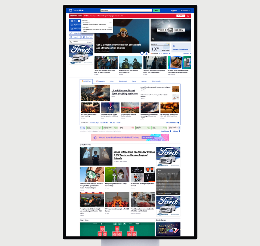
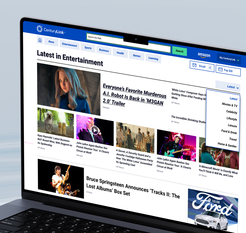
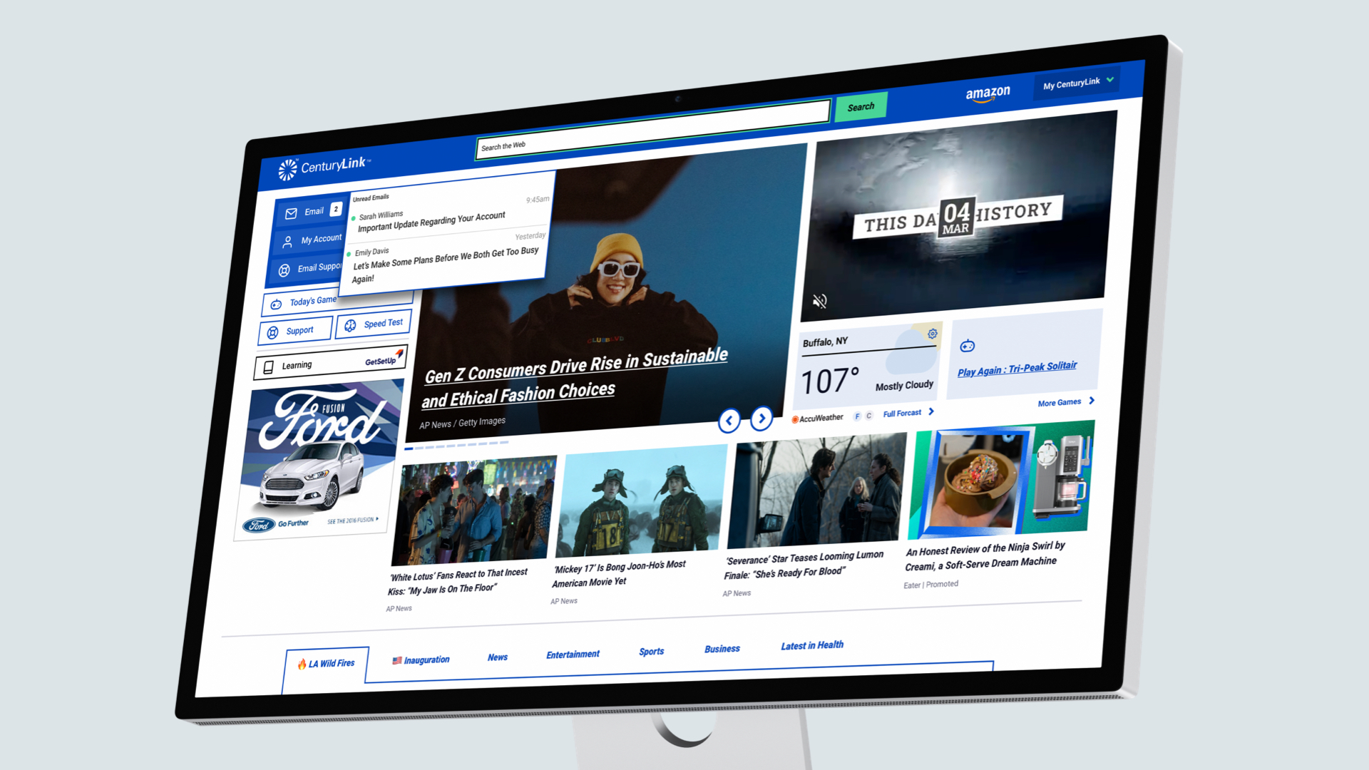
The work focused on elevating the visual design, tightening the UX, and bringing the overall experience up to the standard their brand and users expected — all while working within the established platform architecture and design system. The result was a substantially updated branded experience that carried CenturyLink's identity with more confidence: cleaner, more contemporary, and meaningfully differentiated from the platform baseline.
With data showing that the majority of users were staying on the homepage rather than navigating into content verticals, the homepage became the primary design focus. It was reimagined with a clear sectioned layout — Featured content, News Tabs, Promoted, Today's Game, a Daily Learning Bite — short video tutorials from Get Setup covering topics like optimizing internet performance and staying safe online, targeted to the portal's user demographic — and a Customer Support section with an integrated speed test widget that gave CenturyLink customers immediate utility without leaving the portal. The news browsing verticals were then cleaned up and tightened to match the refreshed homepage, creating a coherent experience across the full product — all while preserving the existing monetization ad units and strategies that the portal depended on.
The modernization also introduced new platform capabilities. An email preview feature was designed and integrated, giving users a snapshot of their CenturyLink inbox directly within the portal without leaving the experience. News Tabs supported editorially managed event tabs — published by the content team for major moments like the Oscars, Olympics, elections, or ongoing events like natural disasters — alongside traditional categories including News, Entertainment, Sports, Business, and Health.
Archipelago Design System
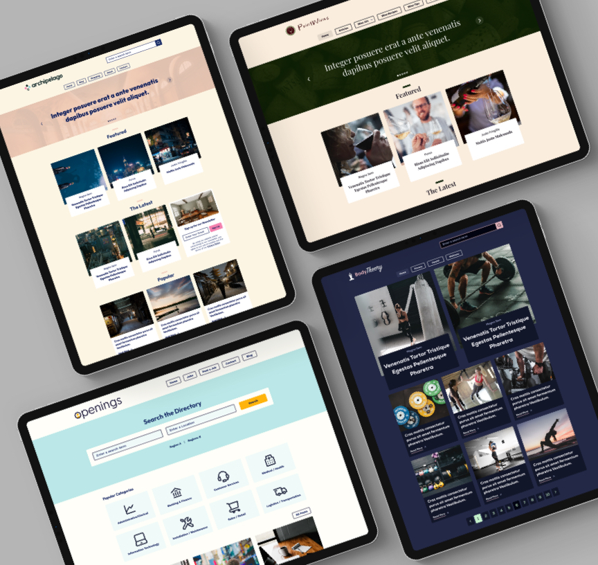
The company owns hundreds of small owned-and-operated content sites — each on its own codebase, with its own brand, no shared feature sets, and no common ad product integration. Pushing a feature out across all of them was a significant undertaking, and in practice they were never truly in sync. Archipelago was built to solve that: an AI-powered design system providing a unified foundation of design tokens, components, and layout templates that any site could build from, enabling features and updates to propagate across the network without rebuilding from scratch each time.
The name reflects the architecture. Like an archipelago — a collection of islands that are distinct but part of the same larger ecosystem — the design system gives each site a shared structural foundation while remaining fully themeable at the brand level. Token-based variables for color, typography, spacing, borders, shadows, and breakpoints form the underlying layer. Components and templates are built entirely from those tokens, so a theme change flows through the system without touching the component architecture — differentiation at scale without drift.
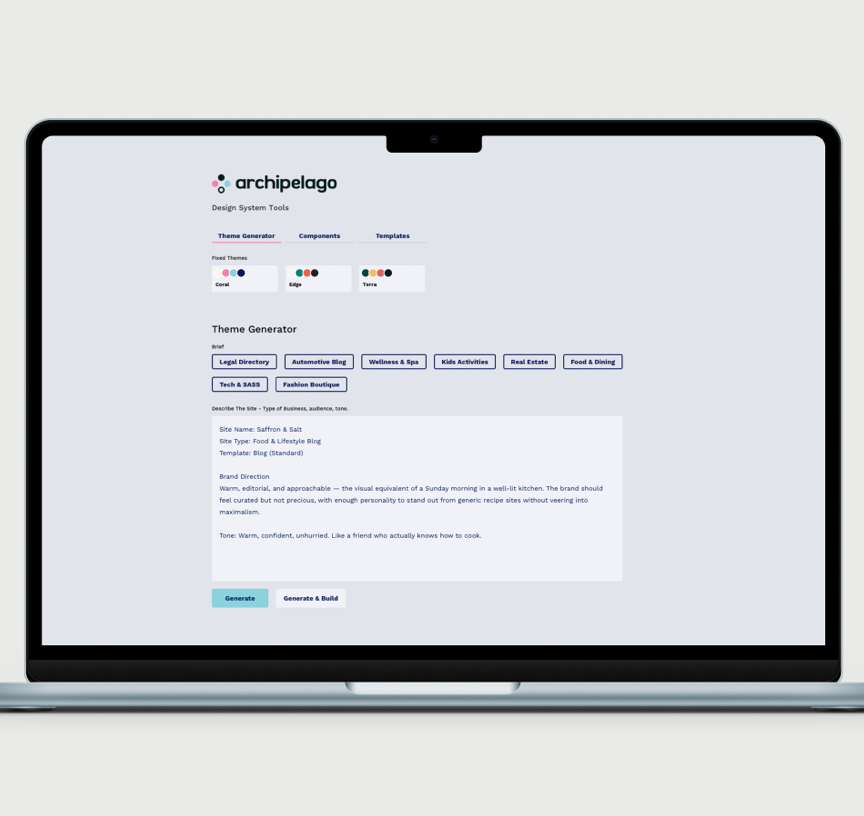
Design flows from Sketch into Zeplin, and from Zeplin into the codebase via its MCP server. Because symbols in Sketch mirror the React component library directly, a design layout pushed into Zeplin already maps to components that exist in code — ingesting a new template is a matter of referencing what's already there rather than building from scratch. An AI-driven theme generation layer produces new themes that map to the existing design tokens — populating the token values that cascade across the component library to theme everything consistently. The result is a straight waterfall from design layout to deployable template, making it extremely easy to add new site templates to the platform directly from design work.
Brand Overhaul
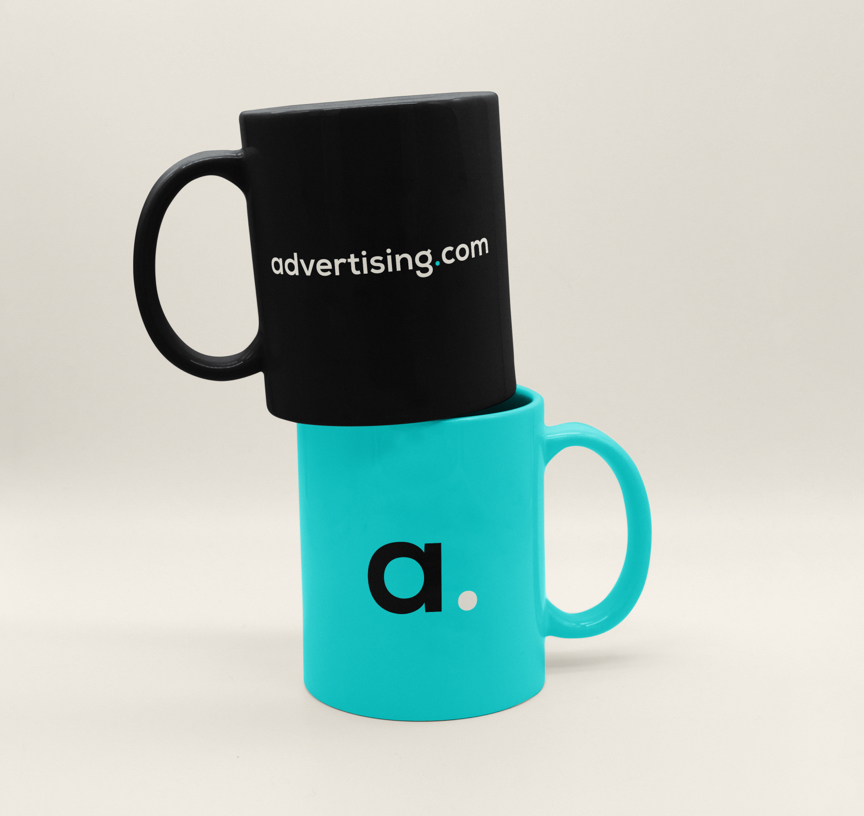
Alongside the portal work, I led a full rebrand of the Advertising.com sub-brand — moving the visual identity from a dated Web 2.0 aesthetic to a modern, premium system built around the authority of the domain itself.
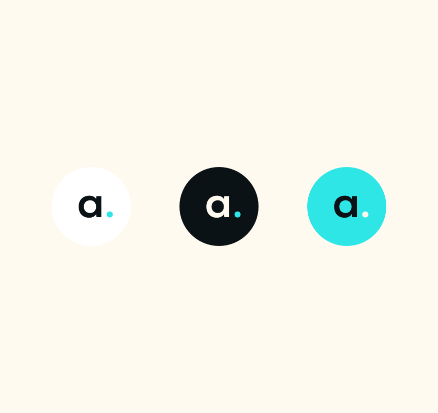
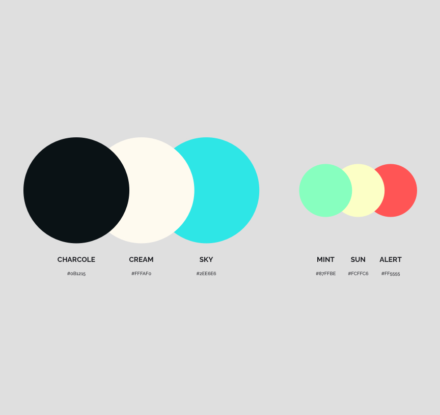
The work produced a complete brand identity: a clean, customized wordmark with a signature cyan accent on the period, a minimal logomark built around the "a." motif, and a refined color system anchored by charcoal and cream with a vibrant SKY accent. Raleway was selected as the brand typeface for its balance of elegance and contemporary accessibility.
The brand refresh reached completion with full guidelines delivered. Due to how the trademark was structured, the legacy brand and logo needed to remain in place during a transition period before the new identity could fully take over. In the interim, select elements of the updated brand were introduced alongside the legacy system as a first step toward migration.